So by now you’ve probably seen the logo change to the G-Suite of apps.
Some people aren’t happy, and while I can sympathise, and wonder what they were thinking, I think it’s important to articulate why the logos are bad.
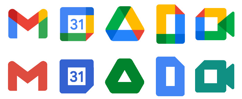
For me, it’s all about colour! The shapes themselves are fine, but they are composed of too many colours! Perhaps a less-is-more approach would be in order? Reducing them down to a single colour gives you something like this…
Not entirely terrible now right? But still overly simplified. And at smaller scales, they should ‘read’ better.
One major complaint I have is that it’s hard to distinguish what the logo is when it’s depicted as a Chrome tab like this…

If you nuke the colours of the Gmail logo to just red, you end up with this…

Having said all of this, perhaps this is just a knee jerk reaction from everyone, we’ve known this logo for such a long time, and now it’s different! Change! Oh no! But not all change should be met with harsh criticism, give it time and maybe it will become second nature to us all.
Perhaps in time we may even learn to enjoy it! 😉
Related articles for reference:-
https://techcrunch.com/2020/10/06/googles-new-logos-are-bad/
https://arstechnica.com/gadgets/2020/10/google-rebrands-g-suite-as-google-workplace-ships-new-multi-colored-icons/